Slide-ology | Nancy Duarte | Summary
Introduction
Slide:ology - The art and science of creating great presentations
Nancy Duarte is the principal of Duarte Design. Her client list is loaded with fortune 500 companies including Adobe, Cisco, Google, HP. They are widely recognised as the leader in presentation development and design.
This book is for you, if you have delivered a high-stakes presentation to peers | boss | customer | general public and found yourself wanting on the quality of your slides.
Presentations require you to think visually and unlike verbal skills - visual expression is neither easy nor natural. It is not taught either. Slide:ology fills that void.

We groan when we have to attend meeting with the slide deck as the star. The 2 guys who invented powerpoint were even quoted in the Wall Street Journal as saying, ‘The best way to paralyse an opposition army is to ship it Powerpoint.’
Presentation software is the 1st application broadly adopted by professionals that requires people to think visually. We can keep blaming the software but in reality we have to take responsibility - Learning to create visual stories is becoming essential.
This book is not a manual for powerpoint. Instead it teaches you, ‘what’ you should do, and ‘why’, to make great presentations.
1 - Creating a new Slide Ideology
Business schools in particular drill their students in management, accounting and technology, but few offer anything approaching Design 101 - the 1 thing that combines creative thinking, analytics, data assimilation and the inherent ability to express oneself visually. Brij’s comment - add engineering schools to business schools and indian scenario is fully covered for our corporate world)
In many instances presentations are last impression a customer has of a company before closing a business deal. Companies spend huge amounts in public advertising and image building but presentations are left as an afterthought as the particular meeting agenda of the presenter rather than building a connection with the audience.
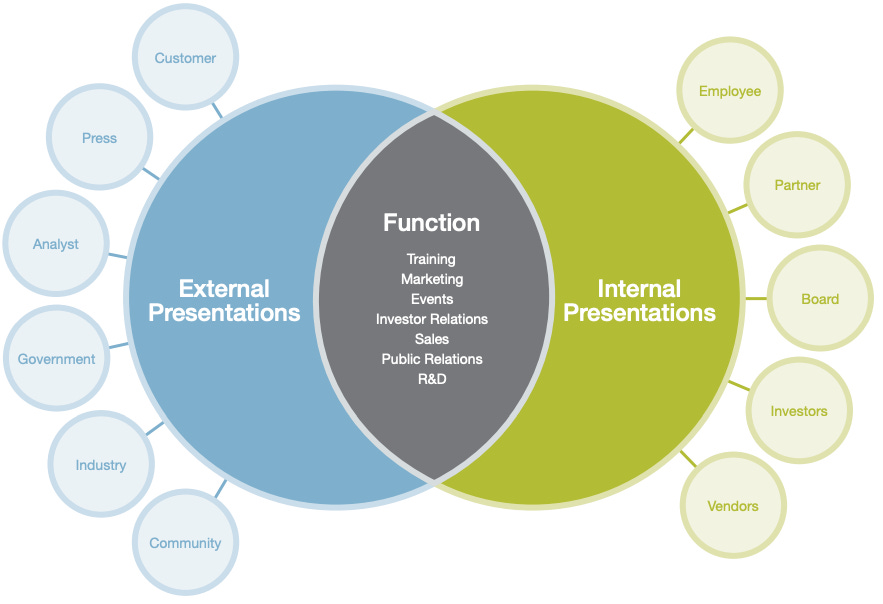
Presentations are incredibly important as a strategic marketing weapon as well as for internal motivation, alignment and engagement.
Upon exceeding a certain number of words - a slide is no more a visual aid. Excess words forces people to read. People can either read or listen, but not do both. On the other hand it easy for people to listen and pay attention to visual communication. That is why good slides - with few words - reinforce speaker’s message.
#doableAction Limit the number of words on a slide.
#doableAction Presentations should be simple and support your communication. They should not entirely be your communication.
Presentation development process is a 3 legged stool. Message, Visual Story and Delivery.
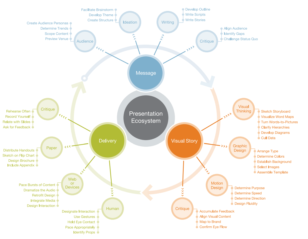
Give the presentation the time and focus it deserves
World class presentations require time and focus. The amount of time required to develop a presentation is directly proportional to how high the stakes are. The amount spent on a presentation is not an indicator of how good it is. You have to do the right things and all of them in harmony to get a good result.
#doableAction Once you know you have a speaking engagement, immediately schedule preparation time and review cycles on your calendar.

Below are some average timeframes and steps for an hour long presentation, that has 30 slides
6-20 hours - research, collect inputs
1 hour - build an audience needs map
2 hours - generate ideas via sticky notes
1 hour - organise ideas
1 hour - colleague’s critique / collaboration around impact of ideas on audience
2 hours - sketch a structure / storyboard
20-60 hours - build the slides in a presentation application
3 hours - rehearse, rehearse, rehearse
36-90 hours total preparation time (for a 1 hour presentation)
Responding to audience needs -
#doableAction Who are you going to be for this presentation to your audience? Their Hero? Their Mentor? Their Cheerleader?
Good presenters aren’t in it for themselves. They are in it for others. Please take note!
#doableAction Answer these 7 questions to knowing your audience
What are they like? Demographics | Psychographics | Take a walk in their shoes and describe what their life looks like.
Why are they here? Do the situation analysis - Why they came? What are they looking for? Were they forced here?
What keeps them up at night? Know their fear | pain point. So you can empathise | offer a solution in your message
How can you solve their problem? How are you going to make their lives better.
What do you want them to do? Ask the question, ‘So What’ to your answer again and again, till it is crisp
How might they resist? What will keep them from adopting your message and call to action
How can you best reach them? in terms of the logistics and medium of the presentation
We ask these questions because the success of your presentation depends on how well it resonates with its audience
In turn, you need to make your audience real to yourself, ahead of working on your presentation.
#doableAction Start by building audience personas before building slides. Paint a picture of a real human, with real needs to you help you connect with them more effectively.
Presentation is not simply about aesthetics or making things pretty. It is about helping your audience make meaning for themselves, from your message.
2 - Creating Ideas - not Slides
Beginnings are messy, but they are fun too.
You may have thought analytically, about the 7 questions earlier, but now a few things are going to happen at the same time
You are now going to create ideas
Do not think of slides or structure yet. It is way too early. Instead focus on capturing the jumble of all the things that are going on in your head as you process these questions and what your own expertise has to say, to all this.
Maybe the answers to questions are showing smaller bullet points. Maybe people’s faces in your mind’s eye and what they could be actually saying (their quotes). Maybe additional questions. All these should be captured for now. Later you will organise them too.
Some ideas are about the message. Some are about the visual story. Some ideas are logical. Some are wacky and out of box.
This is not the time to filter them. It is the time to welcome all ideas and thoughts.The only thing you need to manage is how you manage them. The theme here, at this moment is, Expansion of Possibilities. Just like brain-storming.
#doableAction Use paper and pen. Yes it is old school. It is also how you learnt to think back in school (most of you anyways). Do not fire up your Powerpoint or your Word processor or even your Mind-mapper.. Instead use a sign pen and Post its. One post it, per idea.
If you prefer you can tear an A4 sheet into 4 or 8 parts and start putting pen to paper. Machines and keyboards are not well suited to ideation and visual thinking and while writing ==#doableAction use as few words as possible and draw your thoughts as much as possible, when working with pen and paper.
The combination of a sign pen and small paper size will also encourage your to write as little as possible.
If you are saying, ‘You can not draw’, all it means is that you are out of practice and your inner critic is well informed and well developed :) Think back to how you could easily do in childhood.
Long Term
#doableAction Reclaim your drawing skills. With it - and enough practice - will come the ability to think visually too.
#doableAction get comfortable with drawing a human figure - practice practice practice - this is a fun activity with your children, who can maybe teach you a thing or two and bond with you as equals.

#doableAction Go to a public place and see if you capture the gestures of people around you in stick figures. Do NOT draw the head first. Instead draw the body. After you have drawn the body in a position you want, then draw a circle for the head. Observe how the relationship between body and head shows happy sad active and lazy. Next draw facial expressions. Happy Sad Angry is in the mouth and eye brows. Nose shows direction in which head is pointing. Then add legs. They can show more than arms. Then add arms.
End of Long Term
Just like you need vocabulary to speak, you need some basic drawing short-hands to get started. Then as you speak, you will get better. Begin with stick figures and office props. Google for icons of abstract ideas and make them your own by drawing a few times.
#doableAction your starting point for ideation is the answers to 7 questions you wrote earlier. Move them (questions and your answers) to several post-its and your combination of ‘few words + visual’ on any one post-it.
A few words about ideation and how it usually happens.
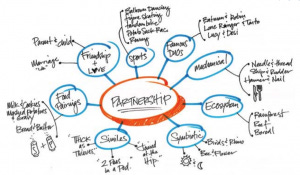
Often ideas come immediately, if you stop judging. That is good.But avoid the pitfall of going with the first thing that comes to the mind.
#doableAction Continue to sketch and force yourself to think through several more ideas.
It takes discipline to continue, when you think you have already cracked it. Explore word associations and word mapping. Get playful. Stronger solutions frequently appear, after 4 or 5 ideas have percolated to the top. Do not judge. Feel free to wander away on tangents and then come back. Do take the time to do this.
Take a break and go away. Then come back and generate some more ideas. Just keep piling them up. Do not organise them yet, till you run out of ideas to write down.
Only then - #doableAction Start putting up your post-its on a wall. If you have used non-glue pieces of paper - you can post them together with a handy glue-stick or a stapler (with the bottom arm of the stapler, moved away and a handle flat surface like thin thermocol sheets).

#doableAction Do your organising, after your ideation (first pass) is done. Then you can go between ideation and organising a few more times, till you are done.
You are not organising for slides or a structure yet. Simply organise for what feels similar or close or related to each other.. Maintain the freedom to change your organising structure. If you must have a structure - Use the 7 questions as the starting point.
#doableAction Once you have a structure in place, explain it to a colleague for clarity of ideas. Then, Reorganise based on how you find yourself explaining and clarifying. Repeat if needed, with another colleague.
#doableAction Be prepared to be surprised by what you come up with, by going slow and different in this approach. If you are sceptical - give it a try, especially when there is no deadline looming large to get things done!
3 - Creating Diagrams
Ideas don’t exist in isolation. They link to each other in associations that can be seen visually. These associations are diagrams.
Let us understand these a little better, before applying them.
A picture is worth a thousand words and in the picture you chose look to see a match between what your message wants to say and what the image is saying
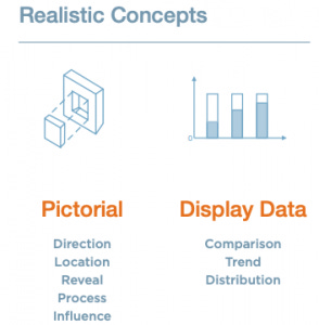
Images are good at revealing -
Direction - from somewhere to somewhere else - some times by the natural way in which eyes move or a guiding arrow or some form of movement to show before and after (Pan)
Location - placing things in Context
Reveal - Through movement - similar to direction (Zoom)
Process - Sequence of Steps
Influence - Relationship between Factors
When it comes to displaying data - please bear in mind that we make sense from data by comparing it in different ways. We can combine them too, to make our point. The important thing is that we must be making a point, not showing data for its own sake.
Comparison - between things (starting from things you can relate to | touch | feel | experience)
Trend - over time
Distribution - between concepts | factors | ideas (moving towards abstract)
Since business situations deal with problems, they quickly tend to move from ‘what’, ‘when’, ‘where’, ‘who’ and ‘how much’ (which are realistic concepts) to ‘why’ and ‘how’ which are abstract concepts.
This is also a place to generalise so that broader concepts can be applied and comparisons made to previous patterns and a therefore the visual language must be able to transfer into abstract concepts as well.
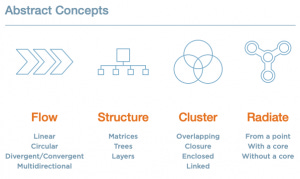
These are self-explanatory, because we study them much more in our professional education (engineering and management, especially so).
#doableAction Fire up your Powerpoint (or Keynote or Canva) and explore diagrams already available (Powerpoint - check under smart art).
#doableAction Revisit your Structure and see if it (or portions of it) match to a diagram, you can use.
Caution - Don’t get fancy, especially in the beginning. Keep things simple.
4 - Displaying Data
Data slides are not about the data. They are about the meaning of the data.
Slides are not great for showing abundant data to the audience, so that they can come to their own conclusions. If you want to do that, then it is better to use printouts and distribute them.
A cluttered or overwhelming data slide can derail a good presenter.
Use the following 5 principles to present data, in the clearest way possible -
#doableAction 1. Tell the truth. That does not mean, you have to present everything in one go
Be prepared to provide the whole data set on request
Be prepared to defend your conclusions
==#doableActon== 2. Get to the point
To communicate your data effectively, you must first state the conclusions you want your audience to adopt. This can be counter-intuitive, if you want ‘data to speak for itself’.
#doableAction 3. Pick the right tool for the job
The data by itself speaks to the Message. Your choice of visuals will determine the Visual Story.
Conclusions can be stated simply with a visual too

Pie charts work only for showing large differences in proportions. Think Percentages (they must add up to 100). The first (largest) data point should start at 12 o’clock position. Have no more than 8 sections in a pie chart.
Bar charts are visually more precise. They can also be stacked for additional information. They require more processing, compared to Pie Charts.
#doableAction 4. Highlight what is important
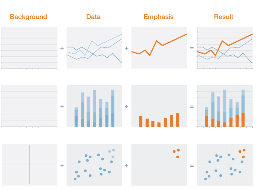
#doableAction 5. Keep it simple
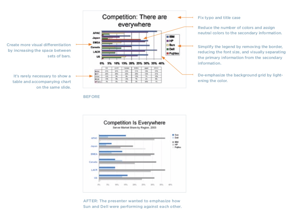
5 - Thinking like a Designer
‘ Thinking like a designer is not about dressing things up
Designers have 3 goals for products and services they design. Make it convenient, simple and elegant for your users to use.
At its heart, it comes down to what you value, what you do and for whom you do it.
This is true for slides too. A slide fails - not due to its stylistic issues but due to its fundamental construction. If it misses the point for being convenient, simple or elegant. If there is discord between the slide and what the audience values and does.
Effective slide design hinges on mastery of 3 things - these will be covered in subsequent chapters.
Arrangement - contrast | hierarchy | unity | space | proximity | flow
Visual elements - background | color | text | images
Movement - timing | pace | distance | direction | eye flow
People have limited ability and energy to understand new things at any time. Presentation slides should remain sensitive to this requirement.
6 - Arranging Elements
How slides are arranged has most impact on whether its message is visually clear. These are your tools - Contrast | Flow | Hierarchy | Unity | Proximity | Whitespace.
Contrast - the audience can identify the main point quickly. #doableAction the Headline of the slide is the place to do this
It is laziness on part of the presenter to put everything on one slide.
Create dominance with some elements and practice restraint with others. Force yourself to make a decision about the priority of the information.

#doableAction Also, Watch out that you are not assigning contrast unintentionally.
It can confuse or contradict the message because all stylistic choices have the potential to suggest importance, urgency and value.
Flow - the audience knows the order in which to process the information. #doableAction notice how comics are arranged.
The typical western pattern is left to right, top to bottom. Arabic cultures read right to left and top to bottom. Far eastern cultures also read top to bottom, then left to right.
The flow is applicable not only to text but also to how to interpret diagrams and images. This is worth bearing in mind as well. The default can also be easily changed by guiding the lines with empty space.

When you chose different heading levels in modern word-processors - you are implementing hierarchy.
Hierarchy - the audience sees the relationship between elements. #doableAction Also notice how a book, its chapter, table of contents and index are organised.
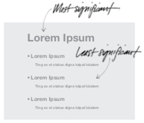
Unity - The audience senses that the information belongs together.
For the content aspect #doableAction notice how a book’s jacket covers and the ‘forward’ sections address, Unity.
For the visual aspect -
At the page level, the grid system (if you have used Google’s New Sites or Wordpress’s Gutenberg editor) is a convenient way to bind disparate elements into a coherent whole.
Designers use a consistent color palette for the same reason.
#doableAction Recreate an existing presentation by limiting your options to default font types (Headings | Captions | body text) and to a particular color palette if 4-6 colours and see if it visually better because of the imposed unity.
Proximity - The audience perceives meaning from the location of elements.
For the content aspect - #doableAction give thought to how you decide what comes first in your presentation?
For the visual aspect - you can show things by placing elements appropriately
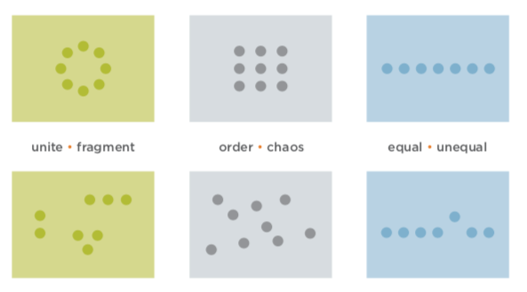
#doableAction Google for it and get familiar with the idea of negative space (aka white space). Learn to see it around you.
A slide’s value is determined not by the amount of information it contains but by how clearly it communicates its message. Negative space is a great highlighter and bold mark maker, when used well and sparingly.
Empty space is like silence. It can be used to emphasise what you have to say.
Whitespace - The audience has visual breathing room. #doableAction Reflect on how ‘less is more’.
7 - Using Visual Elements - Background, Colour, Text
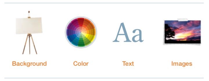
In all these - consistency is key.
Background ==#doableActions== -
When in doubt, keep it simple. Background should never compete with content.
Rule of 3rds - Draw 2 horizontal and 2 vertical lines on the background as if you were going to play tic-tac-toe on the full page. The 4 points where the lines intersect are focal points. Place what you want to emphasise at these points or compose your image accordingly.
Color ==#doableActions== -
Colors have meaning that people attach to them. This may vary by cultures too. Choice of colors should resonate to - your audience, your industry, your own aesthetic.
Use a a palette of few colors consistently across slides instead of randomly choosing any which colors.
Text -
#doableAction Presentations are ‘glance media’ and slides should follow the 3 second rule. Can you make sense of it in 3 seconds?
Which font?
Many designer wars have been fought over Fonts. In the beginning, you should at least know -
Serif Fonts are intended for long sequence of words exceeding one line

Sans Serif do not have little feet that guide letters into each other. They are best used for headlines and captions.

How many words?
While there are no official rules for how many words should be there on a slide, but if you are going to be talking to the slide - ==#doableActions== -
The title one the slide (if you have one) requires careful thought (glance media | invite further reading | summary of sorts)
Use no more than 30 words and 5 distinct thoughts | bullets to state your slide
Feel free to use mnemonics and teasers and even just images - that provoke curiosity till you explain
My personal preference is to avoid sequential reveals and to put the whole slide out there in one go.
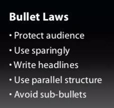
Use Bullets?
==#doableAction== Take a simple slide with and a title and 4 bullet point. Remove the bullets so points remain as text. What do you think?
What font-size?
Guy Kawasaki’s advise, ‘A good rule of thumb for font size is to divide the oldest investor’s age by two and use that as font size’ :)
In today’s era of mixed mobile and regular screens - #doableAction it is a good idea to never dip below 28 points (else too small to see on a mobile screen)
Text Animations?
#doableAction Generally avoid. Ask yourself, ‘Does it add value, meaning or emotion? to the content’.
8 - Using Visual Elements - Images
Photos
Compare the two columns -

Why does the 2nd column work better together?
When choosing images - google for good sources of stock images and even consider using google images by looking for creative commons images with attribution (say).
#doableAction - Look for a consistent style.
When brainstorming for the appropriate images - go beyond the 1st one you find. #doableAction A good rule of thumb is to spend at least 10 minutes finding an image and finding at least 3 good good ones, before you select the final one.
#doableAction Crop and Position your images to ‘Rule of Thirds’.

Illustrations
The key to using illustrations effectively is to keep a consistent style. It is difficult to do this, unless you are an artist yourself or can afford one.
#doableAction (my 0.02) Instead of illustrations - Use a judicious combination of photographs where by manipulating filters, you can get consistent style and Smart Art from powerpoint (remember diagrams?) and consistent (and few) heading styles.
9 - Creating Movement
If you chose to use animation, it should look natural and alive. #doableAction don’t overdo it!
Slow moving animation (#doableAction Check out Ken Burns effect) can help create feeling of nostalgia or passage of time.
Fast moving animations (quick cuts) can help create sense of excitement, energy or surprise. (#doableAction Use Simple transitions)
Animation uses motion, speed and direction for these purpose -
Change in relationship - proximity, hierarchy, flow, comparison
Direction - new viewpoint, cover additionally, uncover
Change in Object - simplify or show complexity
Sequence - Show passage of time, Process
Emphasis - Control eye movement
#doableAction by using transitions between slides - you can stitch them together to create a scene
#doableAction Review your animation(s) against this checklist to see if you are doing it wrong or over doing it
Looks unnatural or counter-intuitive
Pace is too fast, even annoying
Does not add value or serve a purpose
Too many animations
Animation style is inappropriate for the content
Other Notes
Use the 10/20/30 Rule for your Presentations
This comes from Guy Kawasaki - #doableAction A powerpoint presentation should have 10 slides, last no more than 20 minutes and contain no font smaller than 30 points
Treat your Audience as King
They did not come to your presentation to see you. They came to find out what you can do for them. Success means giving them a reason for taking their time, providing content that resonates and ensuring that #doableAction it is clear, what they are to do.
Practice Design, not Decoration
Orchestrate the aesthetic experience by answering the basic questions (see Creating Ideas) and ensuring adequate preparation time. Display information in a way that makes complex information clear.


